AI-PERSONALISED HOMEPAGE EXPERIENCE
Transforming TrueMoney’s homepage into an intelligent, personalised financial experience that adapts to users’ needs, behaviours, and lifecycle moments.

[PROJECT DETAILS]
A strategic homepage transformation project focused on evolving TrueMoney from a service-based wallet into a personalised financial platform. Working closely with product strategists and cross-functional teams, I translated business strategies into scalable user experiences across onboarding, personalised actions, and dynamic homepage content.
DURATION
May - JUL 2025
Role
Senior Product Designer
Team
Product STRATEGY, Business, Marketing, UX Writing, Engineering, Visual Design
SCOPE
Fintech, AI Personalisation, UX Strategy, Product Growth
[PROJECT CONTEXT]
From Digital Wallet to Personalised Financial Platform
TrueMoney provides a wide range of financial services across payments, insurance, investment, credit, and lifestyle products. However, as the ecosystem expanded, the homepage became increasingly complex, making it challenging to deliver the right service to the right user at the right moment.
The goal was to redesign the homepage experience around personalisation, user intent, and lifecycle-driven recommendations.
[CHALLENGES]
Balancing User Needs and Business Growth
The homepage was one of the most valuable spaces in the product, but multiple services competed for visibility.
User Challenge
✦ Users had different financial behaviours and needs
✦ New users had limited data for recommendations
✦ Important actions could be missed among promotional content
Business Challenge
✦ Multiple business units require homepage exposure
✦ Content prioritisation lacked a scalable framework
✦ Promotions need better targeting instead of showing everything to everyone
Creating a Personalisation Framework—Before designing screens, we defined how TrueMoney should personalise experiences across different stages of the customer journey.
The solution focused on three connected systems:

[DESIGN SOLUTIONS]
Solution 01 — Cold Start Experience
Understanding Users Before Data Exists
New users entered TrueMoney with different goals, but the app provided the same experience for everyone. The existing cold start selection experience also created interaction confusion because the UI did not clearly communicate selectable actions.
Design Approach
Instead of focusing only on visual improvement, we redesigned the interaction model:
✦ Simplified selection behaviour
✦ Improved component clarity
✦ Reduced decision complexity
✦ Created structured preference data for personalisation
Services were reorganised into:
Everyday Payments
✦ Money transfer
✦ Retail payment
✦ 7-Eleven payment
✦ Mobile/internet top-up
✦ Online shopping
✦ Entertainment
✦ Bill payment
✦ Games & digital services
✦ Overseas spending
Financial Opportunities
✦ Savings
✦ Investment
✦ Insurance
✦ Credit services
Outcome
Created a foundation for first-time personalisation by connecting user preferences with future recommendation systems.

[DESIGN SOLUTIONS]
Solution 02 — Interactive Action Shelf
Turning Homepage Into a Personal Assistant
Important user actions were hidden across different product journeys, while existing notifications were separated from the main user experience.
Design Approach
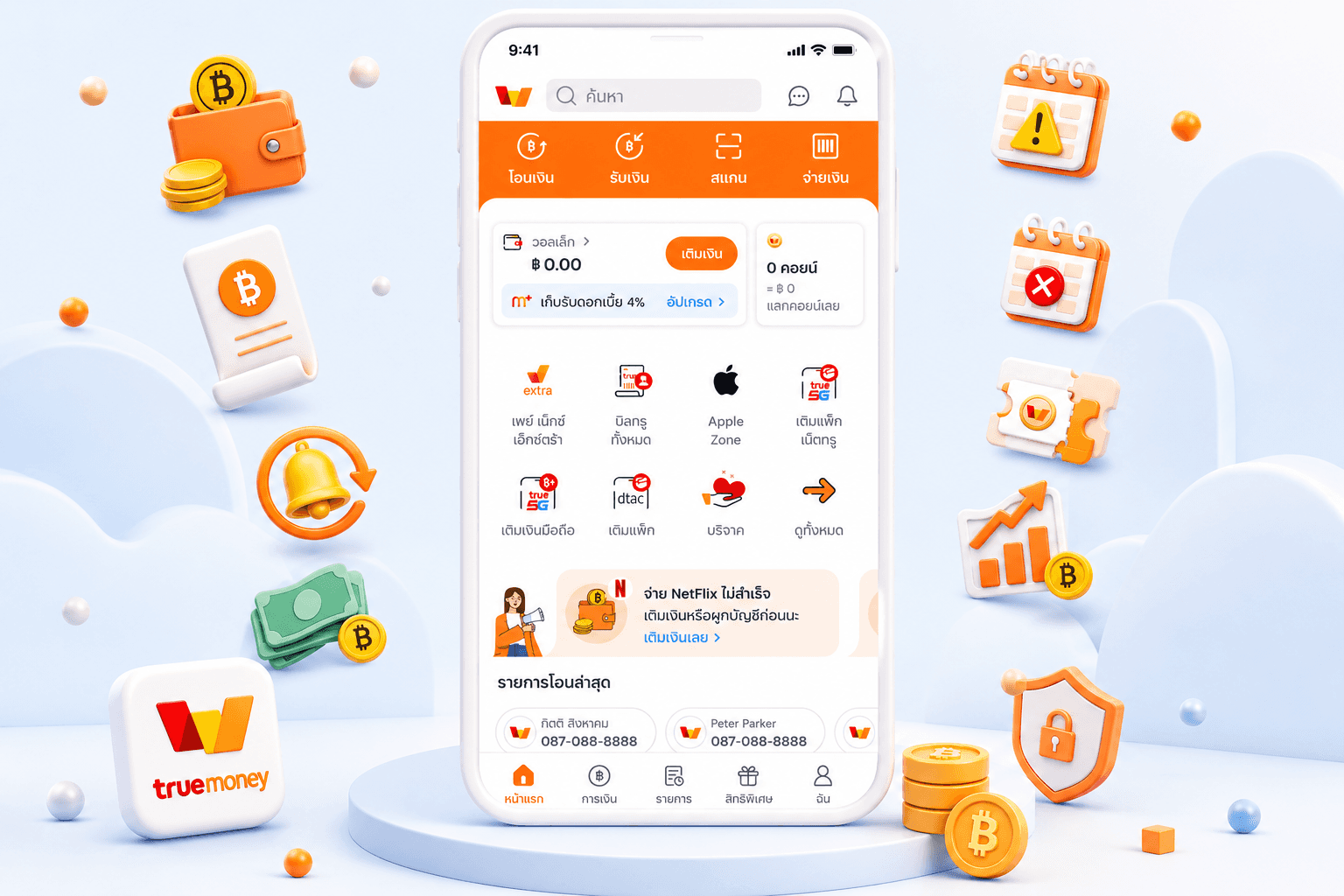
Designed a personalised action component based on four user scenarios:
✦ Account-Based Alert
Critical actions users need to complete. Example: Payment issues, verification, security actions
✦ Funnel Recovery
Helping users continue unfinished journeys. Example: Incomplete applications or abandoned flows
✦ Reminder
Supporting recurring behaviours. Example: Upcoming payments or expiring services
✦ Wallet Growth
Encouraging deeper product adoption. Example: eKYC, top-up, card binding, financial products
Design Execution
Collaborated with visual designers to create a flexible illustration system and worked with engineering teams to define implementation phases based on technical complexity. The concept was presented to leadership before moving into production delivery.

[DESIGN SOLUTIONS]
Solution 03 — Homepage Content Framework
Designing a Scalable System for Multiple Business Needs
As TrueMoney grew, every business unit wanted visibility on the homepage. The challenge was not adding more content — it was deciding: “What should appear, for whom, and when?”
Research & Strategy
Conducted competitor analysis and collaborated with stakeholders to define content priorities. Homepage modules were redesigned around a purpose:
✦ Interactive Shelf
Personalised required actions
✦ Recent & Repeat Usage
Fast access to frequent services
✦ Content Banner
Marketing campaigns and awareness
✦ Value Proposition Lead
New product discovery
✦ SKU Lead
Product conversion
Outcome
Created a scalable homepage framework that allowed teams to:
✦ Prioritise content based on user lifecycle
✦ Support personalised recommendations
✦ Reduce homepage complexity
✦ Balance user needs with business objectives


[COLLABORATION]
Turning Strategy Into Product Execution
Throughout the project, I worked closely with:
✦ Product strategists to translate roadmap direction into UX solutions
✦ UX writers to create clear communication
✦ Marketing and business teams to align service priorities
✦ Visual designers to build illustration systems
✦ Engineers to plan phased implementation
[OUTCOME]
